

A Quick Guide on CSS Positions
Static vs. Relative vs. Absolute vs. Fixed vs. Sticky


# CSS Positioning Types
CSS positioning comes in four basic types. "Static" is the default. By default, all elements have a static CSS position. Then we have Relative, Absolute, Fixed, and finally, we have this new CSS position called Sticky. Now, sticky isn't supported 100% in all web browsers.
# CSS Positioning KeyWords
Whenever using CSS Positioning types, you consistently position your elements using the Top, Right, Bottom, or Left keywords. You're always moving an element based on its top, right, bottom, or left position, so these four keywords are what you'll use in the CSS. You can use pixels, EMS percentages, or any CSS unit of measure that will work, but you will always be working with these four CSS property names.
Static Position
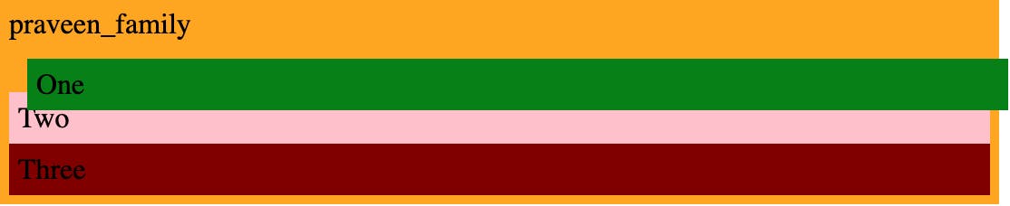
Static is the default position that all of your HTML elements will have when they enter onto the page, and essentially, all static positioning does is say that they should follow the other elements in the document flow, so whatever comes first in our HTML, for example, child number one will be above child number two, and so on. The static position is just like how HTML works.
.one {
  position: static;
}
Most of the items you work with are statically positioned since any element to which you do not add a position attribute will be static. Z-index, top, left, right, and bottom properties cannot be applied to static positioned elements.
Relative Position
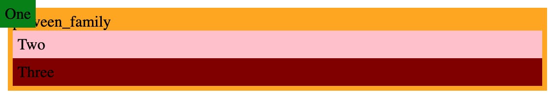
The next position that we want to cover is the relative position. This works almost the same as static positioning. If we change our green child number one to be positioned relative, you notice that nothing will change. Relative position acts exactly like static positioning, but it allows you to do four specific things; their static positioning does not. You can change this element's top, left, right, and bottom positions.
.one {
  position: relative;
  top: 10px;
  left: 10px;
}
 As soon as you add a property like top or left, you can see that the element moves away from its original location relative to these top, left, right, and bottom values. However, you'll see that none of the other components change to reflect the relative positioned element's offset position. This is because every other element bases its position on where the relatively positioned element would have been if it were static and assumes that the relative positioned element has no offsets.
Absolute Position
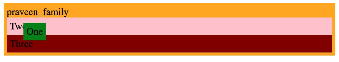
The element is removed from the natural document flow at the absolute position. All other elements will behave as if the element with the absolute position doesn't even exist if you give it a position.
.one {
  position: absolute;
}

Element one is not cited by the layout of elements two and three, as you can see. Additionally, you'll see that element one no longer occupies the entire width. This is because, unlike divs, which are full width by default, absolute positioned elements have their default width set to auto. Additionally, by default, an absolute positioned element will render itself in the document where a static element would have. Still, we may override that behaviour using the top, left, right, and bottom attributes.
*.one {
        position: absolute;
        top: 0px;
        left: 0px;
      }
Now that our element is in its new location, it is in the top left corner of our dashed border. Since a position absolute element will, by default, place itself relative to the body, a top and left of 0 indicates the element will appear in the top left corner of the body. I am using this dashed border to symbolize the entire screen. You can change the element that the absolute positioned element is positioned off of by setting the position of one of its parent elements to anything other than static.
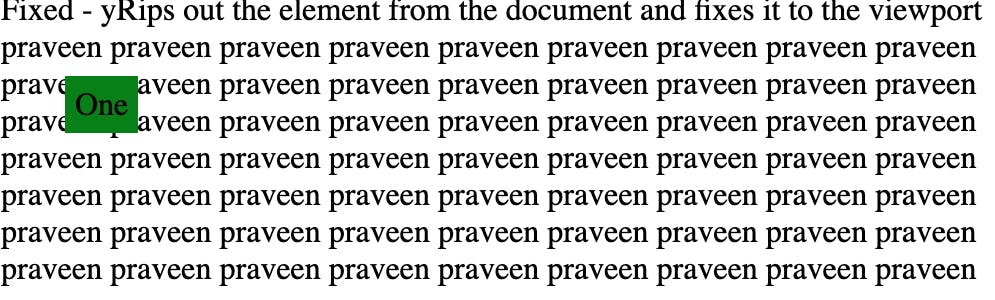
Fixed Position
The next one is fixed positioning. The fixed position is permanently fixed according to the viewport. Its positioning context is the browser window itself which we refer to as the viewport. In fixed positioning, it works basically the same way absolute positioning works, except the parent element, is always the viewport. In this case, if we were to say top 40px, left 40px, this will move down 40 pixels from the top edge, and it will move this way 40 pixels from the left edge.
Additionally, you'll see that it remains fixed in the page's upper-left corner no matter where you scroll. The primary distinction between fixed and absolute is this.
Sticky Position
* .one {
        position: sticky;
        top: 10px;
      }
The last position value is "Sticky." The best aspects of both fixed and static positions are combined in this position. Until the page scrolls to the point where the element reaches the top, left, right, or bottom value supplied, an element with position sticky will behave as if it were statically positioned. When an element reaches the end of its container, it acts like a fixed position element and scrolls with the page.
# Conclusion
There are only a few values for the position property in CSS, but each value includes a lot of specifics about when and how to utilize it. This results in a great deal of complexity as well as great promise.
That's all, folks. I hope you liked it... Till then, Stay strong Dawg 🍻
- References